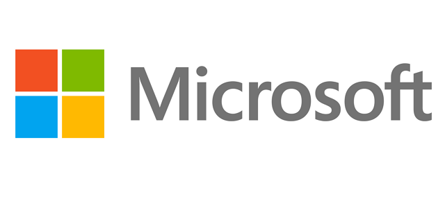
Microsoft rolls out its new logo after 25 years
Microsoft today is introducing its new corporate logo. This happens after 25 years of the last introduction, back in 1987. The new logo consists of 2 parts: the symbol which has four simple squares and includes different colors and with the name using Segoe font “that are intended to express the company’s diverse portfolio of products” . … Read more
